



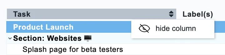
To hide a column, right-click its header and choose hide column. You can also sort your chart by any column.
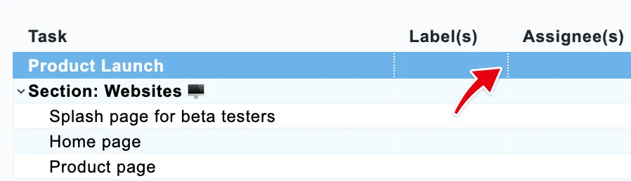
You can adjust the width of each column by dragging the border between two columns with your mouse.
There are different types of columns.
Text column
When you start with a new schedule, it contains a couple of predefined columns, most of which are text columns. In the images above, the first column is named ‘Task’ and describes the activity itself, and the second, ‘Label(s)’, shows the labels on that task. Column names follow the terms of your integration, so yours may read differently.
Start & End date column
The start date column shows the start date of the time block or icon in the row. The end date column shows the end date of the time block or icon in the row. You can change the start or end date by clicking on it. The date format can be customized to your preference.
Duration column
The duration column shows the duration of the planned time blocks in the row itself on the left side and the total duration of a group on the right side. The application calculates these. You can adjust the duration per row by clicking on the left part of this column, but you can’t change the totals on the right side.
Icon column
The icons column shows an icon of the integration you’re using. These icons are direct deep links to the activity represented by that row inside the integration. For example, if you have a Gantt chart for your Trello board, the icon can take you directly to that particular Trello card. But for Basecamp Gantt charts, it can take you directly to a To-do list or calendar event.
Navigation column
The last column in the row is what we call the navigation column. It has no header, but when you hover over this column in a particular row that contains a time block or icon, it shows an arrow icon forward or backward, which will take you directly to that date in the Gantt chart. Especially for larger projects, this can be useful for navigating back and forth on the horizontal axis.